_edited_edited.jpg)
The Power of Color in Design
- lushlayerslife

- Mar 13
- 4 min read
Updated: Apr 6
Color is not just an aesthetic choice; it is a language of its own. It speaks to us in ways that words sometimes cannot. By understanding the emotional impact of color, we can create designs that resonate deeply and leave a lasting impression.
The Emotional Impact of Color
Colors trigger emotions instantly. For example, red often evokes energy, passion, or urgency. Blue tends to calm and soothe, while yellow can bring feelings of happiness and optimism. These emotional reactions come from cultural associations and biological responses.
Red can increase heart rate and grab attention, making it ideal for calls to action or warning signs.
Blue lowers stress and promotes trust, often used in healthcare or relaxation spaces.
Yellow stimulates creativity and warmth but can cause fatigue if overused.
Green connects to nature and balance, creating a sense of peace.
Purple suggests luxury and mystery, often linked to creativity.
Black and white provide contrast and clarity, setting a neutral or sophisticated tone.
Designers must consider these emotional effects to match the intended mood. For example, a spa might use soft greens and blues to promote relaxation, while a sports brand might choose bold reds and blacks to convey strength and excitement.
How Color Sets the Tone in Different Design Contexts
The tone of a design is the overall feeling or attitude it communicates. Color plays a key role in establishing this tone across various fields:
Interior Design
Colors influence how people experience a space. Warm colors like orange and red create a cozy, inviting atmosphere, perfect for living rooms or restaurants. Cool colors like blue and gray make spaces feel calm and spacious, suitable for bedrooms or offices.
Lighting and color combinations also affect tone. A bright yellow wall under natural light feels cheerful, but the same color in dim light might feel overwhelming. Designers often use color palettes that balance warm and cool tones to create harmony.
Graphic Design and Branding
Brand colors shape how customers perceive a company. A brand using green and brown might emphasize eco-friendliness and reliability. Bright, saturated colors like neon pink or electric blue can signal innovation and youthfulness.
Tone in branding can be playful, serious, elegant, or bold, and color choices support these messages. For example, a financial institution might use navy blue to convey trust and stability, while a children’s toy brand might use bright primary colors to feel fun and energetic.
Web and App Design
User experience depends heavily on color. Colors guide users’ attention, indicate interactive elements, and create emotional connections. For example, green buttons often signal “go” or “confirm,” while red buttons warn or cancel.
The tone of a website can be friendly, professional, or creative based on its color scheme. A nonprofit site might use soft blues and greens to feel trustworthy and caring, while a tech startup might use bold contrasts and vibrant colors to feel cutting-edge and dynamic.

Practical Tips for Choosing Colors to Influence Mood and Tone
Choosing colors is not random. Here are some practical steps to make informed decisions:
Define the emotional goal: Decide what feeling or reaction you want to evoke. Should the design feel calm, energetic, trustworthy, or fun?
Research color meanings: Understand cultural and psychological associations of colors relevant to your audience.
Use color combinations wisely: Pair colors that complement each other to avoid visual tension unless tension is intentional.
Test in context: Colors look different on screens, print, and physical spaces. Test how colors appear under different lighting and materials.
Limit the palette: Too many colors can confuse the mood. Stick to a few key colors to maintain clarity and focus.
Consider accessibility: Ensure enough contrast for readability and consider color blindness to make designs inclusive.
Examples of Color Influencing Mood and Tone
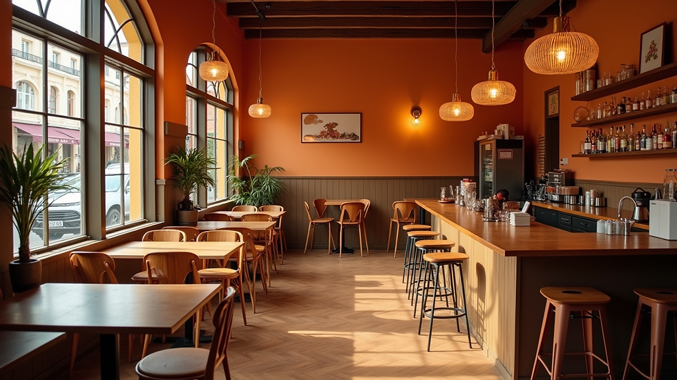
A café using warm oranges and browns creates a cozy, welcoming space that encourages customers to linger.
A meditation app with soft blues and greens promotes calmness and focus, helping users relax.
A children’s book cover with bright reds, yellows, and blues feels playful and grabs attention.
A luxury watch brand using black and gold conveys elegance and exclusivity.
Each example shows how color choices directly shape the mood and tone, influencing how people feel and interact with the design.
The Role of Color in Everyday Life
Color is not just for designers; it affects our daily lives. Think about the colors in your home. Do they make you feel relaxed or energized? The colors we choose for our spaces can significantly impact our mood and productivity.
Color in Fashion
In fashion, color plays a vital role. The right color can boost confidence and enhance personal style. Wearing bright colors can make you feel more vibrant, while softer shades can create a sense of calm. What colors do you gravitate towards when you want to feel your best?
Color in Art
Artists use color to express emotions and tell stories. A painting with bold reds and yellows might evoke passion, while one with blues and greens may inspire tranquility. Have you ever felt a strong emotional response to a piece of art? That’s the power of color at work.
Color in Marketing
In marketing, color influences consumer behavior. Brands carefully select colors to evoke specific feelings and drive sales. For instance, a brand that uses red may aim to create urgency, while one that uses blue might focus on trust. Have you noticed how certain brands make you feel just by their color choices?
Conclusion: Embrace the Power of Color
Color is a powerful tool that can transform designs and influence emotions. By understanding its impact, we can create spaces, products, and experiences that resonate with others. So, the next time you choose a color, think about the feelings it may evoke. Embrace the power of color in your life and let it inspire you to create beauty and connection in everything you do.
Remember, the right colors can elevate your designs and make a lasting impression. Happy designing!
Product Title
16 px collapsible text is perfect for longer content like paragraphs and descriptions. It’s a great way to give people more information while keeping your layout clean. Link your text to anything, including an external website or a different page. You can set your text box to expand and collapse when people click, so they can read more or less info.
$320

Product Title
16 px collapsible text is perfect for longer content like paragraphs and descriptions. It’s a great way to give people more information while keeping your layout clean. Link your text to anything, including an external website or a different page. You can set your text box to expand and collapse when people click, so they can read more or less info.
$900

Product Title
16 px collapsible text is perfect for longer content like paragraphs and descriptions. It’s a great way to give people more information while keeping your layout clean. Link your text to anything, including an external website or a different page. You can set your text box to expand and collapse when people click, so they can read more or less info.
$560


Comments